How California Schools are Ranked
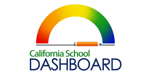
The California School Dashboard is meant to “provide parents and educators with meaningful information on school and district progress so they can participate in decisions to improve student learning,” according to the CA school dashboard website. The Dashboard was created in order to help schools improve where they need it but keeping them accountable, as well as let people understand how the school is doing.
The Dashboard uses subgroups when reporting the information in order to show what groups specifically are striving or struggling in each area. The students groups that are looked at are, “English learners, socioeconomically disadvantaged pupils, foster youth, homeless youth, students with disabilities, and racial/ethic groups.” (CA School Dashboard).
State indicators are what factors go into the Dashboard results and are collected from the local educational agencies (LEA), which are school districts, county offices of education, or charter schools. They use the California Longitudinal Pupil Achievement Data System (CALPADS) and testing vendors to get the data. The state indicators are “Academic indicator (reported separately for English language arts/literacy and mathematics assessments), English learner progress, chronic absenteeism, graduation rate, suspension rate, and college/career readiness (includes Grade 11 assessment results).”
The Dashboard applies the state indicators to each subgroup in order to show how each group performs on their own. Suspension rate is meant to be tracked in order to to indicate if one subgroup is being suspended more often than others. By looking at the performance of subgroups and the whole, parents and administrators can get a better picture of how the school is functioning and what groups need more support from staff.
Performance on the state indicators is indicated by the color that they are labeled by. The colors go from highest to lowest performance level, Blue, Green, Yellow, Orange, and Red. The levels are calculated based on whether or not the current year data shows an improvement from the previous year’s data.
These indicators can be used by parents when looking at prospective schools near the area when looking for a new home. Services like Zillow use the Dashboard information as a part of their school rankings. When looking at homes on Zillow, parents can find a 1 to 10 rating of the schools that children would go to by living in that area. This means that Dashboard rankings can have an impact on new people moving into the area.
The 2020 and 2021 reports are much less indicative of how the school year went because of a state law that suspended the reporting of state indicators for those 2 years. Although Senate Bill 98 and Assembly Bill 130 suspended the publication of some data, they still required that valid and reliable data be published to the Dashboard. This means that for 2020 and 2021, the Dashboard only included the graduation rate additional report and the college/career measures report, according to the California Department of Education.
Mr. Nichols, an assistant principal at Aliso Niguel High School, says that administration uses the Dashboard to understand where the school needs help, and what subgroups need more assistance in certain areas.

Allison is a senior at Aliso Niguel High School and this is her second year in the newspaper. She enjoys playing softball with her team, and loves to read...